Highcharts无需像flash图表那样需要预先加载flash控件,因此它兼容几乎所有的浏览器,包括iphone以及老掉牙的IE6。Highcharts还提供丰富的参数配置,开发人员可以通过不同的配置生成各种图表。此外,Highcharts还支持图表导出,图表局部放大,图表提示、多图表共存等多种特性。您可以到highcharts官方网站下载最新的版本:http://www.highcharts.com/。本文先介绍highcharts简单的使用方法,后面我们会通过前后台并与数据库结合讲解highcharts的具体使用,先看教程:
准备
我们要先将jquery库以及highcharts图表库。
<script type="text/javascript" src="js/jquery.js"></script>
<script type="text/javascript" src="js/highcharts.js"></script>
<script type="text/javascript" src="js/modules/exporting.js"></script>
XHTML
在需要放置图表的页面body中加入以下代码:
<div id="chart_line" style="width: 800px; height: 400px; margin: 0 auto"></div>
Javascript
具体请看代码:
var chart;
$(function() {
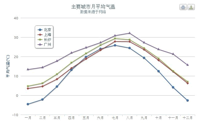
chart = new Highcharts.Chart({
chart: {
renderTo: 'chart_line', //放置图表的DIV容器对应的id属性
defaultSeriesType: 'line' //图表类型line, spline, area, areaspline, column, bar, pie ,
scatter
},
title: {
text: '主要城市月平均气温', //图表标题
x: -20 //center
},
subtitle: {
text: '数据来源于网络', //副标题
x: -20
},
xAxis: { //x轴
categories: ['一月', '二月', '三月', '四月', '五月', '六月', '七月', '八月', '九月',
'十月', '十一月', '十二月']
},
yAxis: { //y轴
title: {
text: '平均气温(°C)'
},
plotLines: [{
value: 0,
width: 1,
color: '#808080'
}]
},
tooltip: {
formatter: function() { //当鼠标悬置数据点时的格式化提示
return '<b>' + this.series.name + '</b><br/>' + this.x + ': ' + this.y + '°C';
}
},
legend: { //【图例】位置样式
layout: 'vertical', //【图例】显示的样式:水平(horizontal)/垂直(vertical)
backgroundColor: '#FFFFFF',
align: 'left',
verticalAlign: 'top',
x: 100,
y: 70,
floating: true,
shadow: true
},
series: [{
name: '北京',
data: [ - 4.6, -2.2, 4.5, 13.1, 19.8, 24.0, 25.8, 24.4, 19.3, 12.4, 4.1, -2.7]
},
{
name: '上海',
data: [3.5, 4.6, 8.3, 14.0, 18.8, 23.3, 27.8, 27.7, 23.6, 18.1, 12.2, 6.2]
},
{
name: '长沙',
data: [4.7, 6.2, 10.9, 16.8, 21.6, 25.9, 29.3, 28.7, 24.3, 19.0, 12.5, 7.0]
},
{
name: '广州',
data: [13.3, 14.4, 17.7, 21.9, 24.6, 27.2, 30.8, 32.1, 27.2, 23.7, 21.3, 15.6]
}]
});
});
这样,就可以生成一个漂亮的线状图表了。要想对highcharts的应用有更深入的了解,请关注本站后面的文章。

共3条评论
为什么不能显示出来
<!DOCTYPE html>
<html>
<head>
<title></title>
<script src="http://code.highcharts.com/stock/highstock.js"></script>
<script src="http://code.highcharts.com/stock/modules/exporting.js"></script>
<script src="jquery-2.1.1.js"></script>
<script>
var chart;
$(function() {
chart = new Highcharts.Chart({
chart: {
renderTo: 'chart_line', //放置图表的DIV容器对应的id属性
defaultSeriesType: 'line' //图表类型line, spline, area, areaspline, column, bar, pie , scatter
},
title: {
text: '主要城市月平均气温', //图表标题
x: -20 //center
},
subtitle: {
text: '数据来源于网络', //副标题
x: -20
},
xAxis: { //x轴
categories: ['一月', '二月', '三月', '四月', '五月', '六月', '七月', '八月', '九月',
'十月', '十一月', '十二月']
},
yAxis: { //y轴
title: {
text: '平均气温(°C)'
},
plotLines: [{
value: 0,
width: 1,
color: '#808080'
}]
},
tooltip: {
formatter: function() { //当鼠标悬置数据点时的格式化提示
return '<b>' + this.series.name + '</b><br/>' + this.x + ': ' + this.y + '°C';
}
},
legend: { //【图例】位置样式
layout: 'vertical', //【图例】显示的样式:水平(horizontal)/垂直(vertical)
backgroundColor: '#FFFFFF',
align: 'left',
verticalAlign: 'top',
x: 100,
y: 70,
floating: true,
shadow: true
},
series: [{
name: '北京',
data: [ - 4.6, -2.2, 4.5, 13.1, 19.8, 24.0, 25.8, 24.4, 19.3, 12.4, 4.1, -2.7]
},
{
name: '上海',
data: [3.5, 4.6, 8.3, 14.0, 18.8, 23.3, 27.8, 27.7, 23.6, 18.1, 12.2, 6.2]
},
{
name: '长沙',
data: [4.7, 6.2, 10.9, 16.8, 21.6, 25.9, 29.3, 28.7, 24.3, 19.0, 12.5, 7.0]
},
{
name: '广州',
data: [13.3, 14.4, 17.7, 21.9, 24.6, 27.2, 30.8, 32.1, 27.2, 23.7, 21.3, 15.6]
}]
});
});
</script>
</head>
<body>
<div id="chart_line" style="width: 800px; height: 400px; margin: 0 auto"></div>
</body>
</html>
感谢博主分享! BTW,验证码能否支持刷新。