当屏幕足够小时(如手机移动设备),会在屏幕右下角展示一个图标,触控图标,则会展开导航菜单,点击菜单页面会滚动到对应的节点,效果非常酷。
HTML
我们的导航条是一个无序列表ul,包含在nav.cd-vertical-nav内,通过连接a#section1关联到对应的节点。元素button.cd-nav-trigger是用来作为小屏幕设备上的用来触发菜单的按钮。section.cd-section就是用来对应导航节点的内容。
<nav class="cd-vertical-nav">
	<ul>
		<li><a href="#section1" class="active"><span class="label">Intro</span></a></li>
		<li><a href="#section2"><span class="label">Events</span></a></li>
		<!-- additional navigation items here -->
	</ul>
</nav>

<button class="cd-nav-trigger cd-image-replace">Open navigation<span aria-hidden="true"></span></button>

<section id="section1" class="cd-section">
	<div class="content-wrapper">
		<h1>垂直固定导航</h1>
		<a href="#section2" class="cd-scroll-down cd-image-replace">scroll down</a>
	</div>
</section>

<section id="section2" class="cd-section">
	<div class="content-wrapper">
		<!-- section content here -->
	</div>
</section>
CSS
HTML结构部署好后,我们要为页面添加必要的CSS样式。在非常小的屏幕下(视图宽度小于800px),我们将.cd-nav-trigger和<nav>的位置固定position: fixed在页面右下角。当点击或者触摸.cd-nav-trigger时,我们使用CSS3来做一个平滑的过渡动画使之有一个展开导航菜单的动画。
.cd-nav-trigger {
  display: block;
  position: fixed;
  z-index: 2;
  bottom: 30px;
  right: 5%;
}

.cd-vertical-nav {
  position: fixed;
  z-index: 1;
  right: 5%;
  bottom: 30px;
  transform: scale(0);
  transform-origin: right bottom;
  transition: transform 0.2s;
}
.cd-vertical-nav.open {
  transform: scale(1);
}
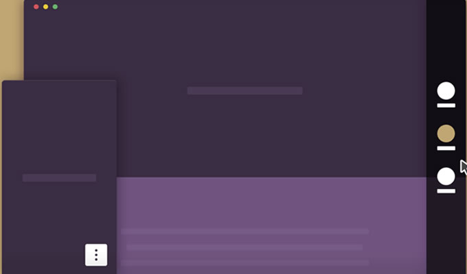
那么在大的屏幕设备上,我们首先是要 Modernizr 来检测当前使用的设备是否支持触屏,在非触控屏上会有鼠标滑上的效果。我们将右侧的垂直导航条设置为固定的高度和宽度,并将其固定在页面右侧。默认右侧导航之显示几个圆点,当鼠标滑上圆点时,导航条会打开,可以选择导航菜单。
@media only screen and (min-width: 800px) {
  .cd-vertical-nav {
    right: 0;
    top: 0;
    height: 100vh;
    width: 90px;
  }
  .cd-vertical-nav::before {
    /* this is the navigation background */
    content: '';
    position: absolute;
    top: 0;
    left: 0;
    width: 100%;
    height: 100%;
    background: rgba(0, 0, 0, 0.8);
    transform: translateX(100%);
    transition: transform 0.4s;
  }
  .no-touch .cd-vertical-nav:hover::before,
  .touch .cd-vertical-nav::before {
    transform: translateX(0);
  }
  .cd-vertical-nav .label {
    display: block;
    transform: translateX(100%);
    transition: transform 0.4s;
  }
  .no-touch .cd-vertical-nav:hover .label,
  .touch .cd-vertical-nav .label {
    transform: translateX(0);
  }
}
为了创建圆点和图标,可以使用::after和::before来为a元素添加伪类。
@media only screen and (min-width: 800px) {
  .cd-vertical-nav a {
    position: relative;
    padding: 3em 0 0;
    margin: 1.4em auto;
  }
  .cd-vertical-nav a::before,
  .cd-vertical-nav a::after {
    /* used to create the filled circle and the background icon */
    content: '';
    position: absolute;
    left: 50%;
    transition: transform 0.4s 0s;
  }
  .cd-vertical-nav a::before {
    /* filled circle */
    top: 0;
    height: 32px;
    width: 32px;
    border-radius: 50%;
    background: #eaf2e3;
    transform: translateX(-50%) scale(0.25);
  }
  .cd-vertical-nav a::after {
    /* icon */
    top: 8px;
    height: 16px;
    width: 16px;
    background: url(../img/cd-nav-icons.svg) no-repeat;
    transform: translateX(-50%) scale(0);
  }
  .no-touch .cd-vertical-nav:hover a::before,
  .no-touch .cd-vertical-nav:hover a::after,
  .touch .cd-vertical-nav li:nth-of-type(n) a::before,
  .touch .cd-vertical-nav li:nth-of-type(n) a::after {
    transform: translateX(-50%) scale(1);
  }
}
当然到这里效果已经实现了,但是要实现点击导航菜单时页面做平滑滚动效果则需要借助jQuery来实现滚动动画。本例在下载源码包里已经打包了包含的全部jQuery代码,请大家下载后查看,本文不再描述。

共1条评论
菜单效果很6,但页面不是整屏滑动的