HTML
HTML结构非常简单,一个有序列表ol,外面又<nav>包裹。
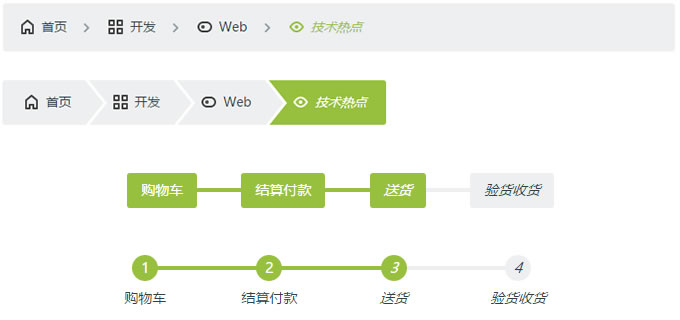
面包屑导航条的结构,我们给ol加上class样式为:.cd-breadcrumb,那么当前位置的层级li加上class样式为:.current。
<nav>
	<ol class="cd-breadcrumb">
		<li><a href="#0">首页</a></li>
		<li><a href="#0">开发</a></li>
		<li><a href="#0">Web</a></li>
		<li class="current"><em>技术热点</em></li>
	</ol>
</nav>
多步骤指示的结构,我们给ol加上class样式为:.cd-multi-steps,已完成的步骤的li加上class样式:.visited,当前步骤li加上class样式:.current。
<nav>
	<ol class="cd-multi-steps text-center">
		<li class="visited"><a href="#0">购物车</a></li>
		<li class="visited" ><a href="#0">结算付款</a></li>
		<li class="current"><em>送货</em></li>
		<li><em>验货收货</em></li>
	</ol>
</nav>
CSS
首先,我们使用::after伪元素来创建分隔符元素,就是层级之间的分割。
.cd-breadcrumb li::after, .cd-multi-steps li::after {
  display: inline-block;
  content: '\00bb';
  margin: 0 .6em;
  color: #959fa5;
}
如果我们需要使用自定义的分隔符,可以自定义样式 .custom-separator,并将样式添加到<ol>元素上,例如:
<nav>
	<ol class="cd-breadcrumb custom-separator">
		<li><a href="#0">首页</a></li>
		<li><a href="#0">开发</a></li>
		<li><a href="#0">Web</a></li>
		<li class="current"><em>技术热点</em></li>
	</ol>
</nav>
完了分隔符的样式.custom-separator这样写:
.cd-breadcrumb.custom-separator li::after,
.cd-multi-steps.custom-separator li::after {
  /* replace the default separator with a custom icon */
  content: '';
  height: 16px;
  width: 16px;
  background: url(../img/cd-custom-separator.svg) no-repeat center center;
  vertical-align: middle;
}
如果你像给面包屑导航和分步骤指示加上小图标,可以这些写样式,本例中我们使用svg文件来作图标处理。
.cd-breadcrumb.custom-icons li > *::before,
.cd-multi-steps.custom-icons li > *::before {
  /* add a custom icon before each item */
  content: '';
  display: inline-block;
  height: 20px;
  width: 20px;
  margin-right: .4em;
  margin-top: -2px;
  background: url(../img/cd-custom-icons-01.svg) no-repeat 0 0;
  vertical-align: middle;
}
.cd-breadcrumb.custom-icons li:not(.current):nth-of-type(2) > *::before,
.cd-multi-steps.custom-icons li:not(.current):nth-of-type(2) > *::before {
  /* change custom icon using image sprites */
  background-position: -20px 0;
}
.cd-breadcrumb.custom-icons li:not(.current):nth-of-type(3) > *::before,
.cd-multi-steps.custom-icons li:not(.current):nth-of-type(3) > *::before {
  background-position: -40px 0;
}
.cd-breadcrumb.custom-icons li:not(.current):nth-of-type(4) > *::before,
.cd-multi-steps.custom-icons li:not(.current):nth-of-type(4) > *::before {
  background-position: -60px 0;
}
.cd-breadcrumb.custom-icons li.current:first-of-type > *::before,
.cd-multi-steps.custom-icons li.current:first-of-type > *::before {
  /* change custom icon for the current item */
  background-position: 0 -20px;
}
.cd-breadcrumb.custom-icons li.current:nth-of-type(2) > *::before,
.cd-multi-steps.custom-icons li.current:nth-of-type(2) > *::before {
  background-position: -20px -20px;
}
.cd-breadcrumb.custom-icons li.current:nth-of-type(3) > *::before,
.cd-multi-steps.custom-icons li.current:nth-of-type(3) > *::before {
  background-position: -40px -20px;
}
.cd-breadcrumb.custom-icons li.current:nth-of-type(4) > *::before,
.cd-multi-steps.custom-icons li.current:nth-of-type(4) > *::before {
  background-position: -60px -20px;
}
当然,我们也可以将三角形箭头设置成分隔符,代码如下:
.cd-breadcrumb.triangle li::after,
  .cd-breadcrumb.triangle li > *::after {
    /*
    	li > *::after is the colored triangle after each item
    	li::after is the white separator between two items
    */
    content: '';
    position: absolute;
    top: 0;
    left: 100%;
    content: '';
    height: 0;
    width: 0;
    /* 48px is the height of the <a> element */
    border: 24px solid transparent;
    border-right-width: 0;
    border-left-width: 20px;
  }
  .cd-breadcrumb.triangle li::after {
    /* this is the white separator between two items */
    z-index: 1;
    -webkit-transform: translateX(4px);
    -moz-transform: translateX(4px);
    -ms-transform: translateX(4px);
    -o-transform: translateX(4px);
    transform: translateX(4px);
    border-left-color: #ffffff;
    /* reset style */
    margin: 0;
  }
  .cd-breadcrumb.triangle li > *::after {
    /* this is the colored triangle after each element */
    z-index: 2;
    border-left-color: inherit;
  }
  .cd-breadcrumb.triangle li:last-of-type::after,
  .cd-breadcrumb.triangle li:last-of-type > *::after {
    /* hide the triangle after the last step */
    display: none;
  }
对于分步骤指示我们还可以添加class如:.text-center, .text-top和 .text-bottom来让文字的位置对齐,还可以添加class如count用来标记步骤数,如以下代码:
<nav>
	<ol class="cd-multi-steps text-bottom count">
		<li class="visited"><a href="#0">购物车</a></li>
		<li class="visited" ><a href="#0">结算付款</a></li>
		<li class="current"><em>送货</em></li>
		<li><em>验货收货</em></li>
	</ol>
</nav>
各种添加的样式具体可以看演示demo,我们的demo中给出9种不同的示例,查看页面源代码你就会有收获。

共3条评论
34
545654
一天突然